Thursday, 16 April 2015

Contextual Portfolio ~ Floppy Disk Woman


This particular image caught my attention as it could be representation of the materialistic ways of modern society, the use of floppy disks represents the changes and improvements in technology and the advancements that we have made. For this reason it has a somewhat futuristic twist to it.
The style is almost a montage style of floppy disks and this is then almost constructed as a collage to create the woman. the style of woman that they have used can also be considered significance as she has no real female features, the hair is not long and therefor she can not be stereotyped as a woman due to the length of her hair and the bone structure is very neutral. She has an almost robotic appearance which might represent the contrast between modern technology and the floppy disk. 

Although the colours used are somewhat reflective of the colours that the woman would be, it is also slightly abstracted due to the use of blue, further adding to the illusion that the woman might be considered somewhat robotic in appearance. 

The piece has a very postmodern twist to it and may be created ignored to represent the disagreement with the use of new media and materials, hence the use of a floppy disk in the creation of the piece. This would be a contrasting view to if the image had been created in a futuristic style as it would then be an appreciation of the technological advancements. 

Wednesday, 1 April 2015

Contextual Portfolio ~ A Closer Look at Yummei

During my Earth Artifact research I touched briefly on the artworks of Yuumei, however having had lectures on the ideas of subliminal messages and deeper meaning, I wanted to research a little more into some of the artist’s designs and explore the true context of the work.


Beginning with this particular design, which clearly resembles an hourglass for a motif of time. The motif focuses on our running out of time to make changes and improvements to the world. The top half of the hourglass is created to effect the viewer emotionally, the colours are peaceful and relaxed, accompanied by a mother bear with her cub. This allows the viewer to feel a sense of happiness when they first look at the image as they are initially drawn to the brighter colours of the design and the lighting effects are the top of the hourglass. The arrow shape of the iceberg that the bears are stood on and the gradual darkening of colour then draws the viewer down to the bottom half where the design represents the modern changes and impact of the decisions that we are making. 


Shadowed by a completely modern and industrial cityscape, the now dark and dingy water contains various items of litter and several more materialist items that act as motifs. Some of the items on show include a girl, a couch, various food items, a television and a game controller. All of which would probably suggest the girl was playing on the console whilst lay on the couch snacking. 


I feel that the intentions of this image are to address our increasing obsession with material items and the laziness of modern society and the lack of appreciation we have for the natural world around us that is effectively suffering. The girls drowning represent how it will effect us if we don’t begin to care more about the world around us. Overall the impact that this image has on the viewer is very strong, the emotional contrast that it causes by moving from the bright colours to the dark greens and blacks causes emotional and visual discomfort and then the subject of each half of the design further enhances that.


The next image that I would like to focus on features a woman holding petrol pump to her heart, pumping oil from what would appear to be the sea into her body. Immediately I see the link between our obsession with material goods and our disregard for the nature around us, this is shown through various dead fish scattered among the dirty water she is stood in and also the bird that appears to be being worn as a sort of fashion statement on the woman’s head. 


Again in the background of this image there is an industrial landscape featuring smoke and factories. Unlike the image with the hourglass, this image contains no positive connotations or emotions and is completely negative in all that it contains. The dark colours used draw attention to the negative subject of the image and the subtle use of the colour red on the petrol pump and the woman’s heart would suggest that there is a danger in the connection between the human race and material goods and the overall design effects the result of this if it is taken too far.


I have also featured a few more of Yuumei’s images that appear to have a similar message being portrayed through the designs. Some images are more positive, showing a better alternative or a brighter future. Others of the images simply put it straight to the viewer that the negative impacts that we are having on the earth are very severe and if no changes take place then the horrific images will be likely to come true.


As I said, this was only part of my research on the Earth Artifact brief and I collected a large array of different designs and ideas to sway my influences towards a final piece. Although I have not annotated all of these ideas, I have compiled a board simply to visually inspire me when I visit it. Please follow the link below if you would like to explore this board further.


Tuesday, 24 March 2015

Contextual Portfolio ~ Delores

Delores work is sensitive to the context of your time and there is a very innovative approach to it. He talks about the idea of old concepts as being a bit like law, or a court case, if we apply what he is saying about law, he is questioning the idea that when a judge does what he does it look back through a textbook of law cases, finds the one that fits the situation most and then applies it. 


What happens in reality is that the application of the law should have something unfamiliar in the case that he is presented with, and it should be creatively responded to. What Delores wants to say is that the law doesn't operate like that and it's fundamental that there is a massive amount of innovation and the court is a very creative space as the judges have to create new kinds of law to respond to unique situations. 90% of law is jurisprudence where the laws are created in response to a new case. C.S Pierce, abductive reasoning we are confronted with something unusual. You have to generate a hypothesis on what might happen and what would wrong put things. The construction of a hypothesis is created by seeing something irregular and creating something for it. This involves a creative thought process.

 Both are showing us that every aspect of the research process, they all require an enormous amount of creative thinking. They are very tied to the idea of semiotics, the idea of receiving signs from the world that indicate that something is going on and then trying to work through those situations and solve them.  Delores is one of the more contemporary artistic theorists and he does something very interesting in terms of how he theorises art itself, he tried to materialise art, ultimately all aspects of creativity come down to the material transverse of the world he doesn't try and place the operation of creativity at the level of the artist. It's the world, matter itself that is creative and not artists, he has a very scientific picture of what art is as he sees it as the worlds producing new stuff and within a material changing world. He gives the world a creative agenda. This is what creates a new context. It's a very confrontational position within the arts, it invests nothing in the artist and the artist is just a shell and an expression of the creativity in the world. It ties together, matter, sensation and concepts and it's this materialist agenda that plugs it I tot he sciences but gives it an artistic view of scientific investigation.

Process and Production ~ Creating a Typeface

 I found this exercise particularly tricky as it was difficult to initially find the inspiration to create the shapes and forms of the letters as well as allowing the font to have a consistency about it. To begin with I browsed a variety of pictures to gain inspiration on the forms of the letters. I looked at architectural forms, patterns and textures on different surfaces and created a few quick mock ups of the kinds of things I would like to create. 


When experimenting with the fonts I would draw guidelines as shown below, this enabled me to ensure that the letters were consistent tin many of their features: Width, height, where the centre lines were on letters such as 'E' and 'F' as it would look strange and unprofessional if these were not the same distance on each.


I decided that I really liked the fourth font that I created as it had a very gothic look to it which I thought was very unique. I had used the image below as an influence to create this, the details on the iron railings along with the spiralling, this inspired the curly formations of the font.


From the letters that I had experimented with I then created an entire alphabet, continuing to change and adapt the letters to how I felt best fit with how I wanted them to look. Some letters worked better than others, I particularly like the appearance of the letters 'A', 'I' and 'O' in this design.


Due to the amount of swirls and curves in the design I though it would be best to test it before taking it any further and correctly so, as once the font was formatted into any other word than the alphabet, the letters began to interfere with one another. I do really like this font and think that it would work really effectively for a title or something similar where the design focuses on a single word and time is spent arranging and altering the letters to fit together as a design. It is however, not very apt for what I am wanting to create.


I decided to work on the top font, and adapt it to make it more simple than in the initial sketch ups. I based this design on the divider in the image below. I really liked the shape of the stone piece  and thought that it would provide a very strong foundation to provide the majority of forms in my font.


I sketched up each letter accordingly and then worked through it, adapting and changing the letter until I was happy with it, I then created a neat version at the end, adding any notes for myself to see when the letters had been scanned in. Below I have shown some of the letters in which I underwent this process.


Once I had completed the process of finalising each letter to the design I liked, I scanned the images in and separated each of the final letters to create an alphabet as shown below. Again leaving the notes on each of the letters so that I could use these when creating the final result of my font.


As with the other font there are a few letters which I prefer and others that didn't work as effectively as I had hoped. The important thing however is that the design is consistent throughout the whole font and it is evident that they are all part of the same design. 
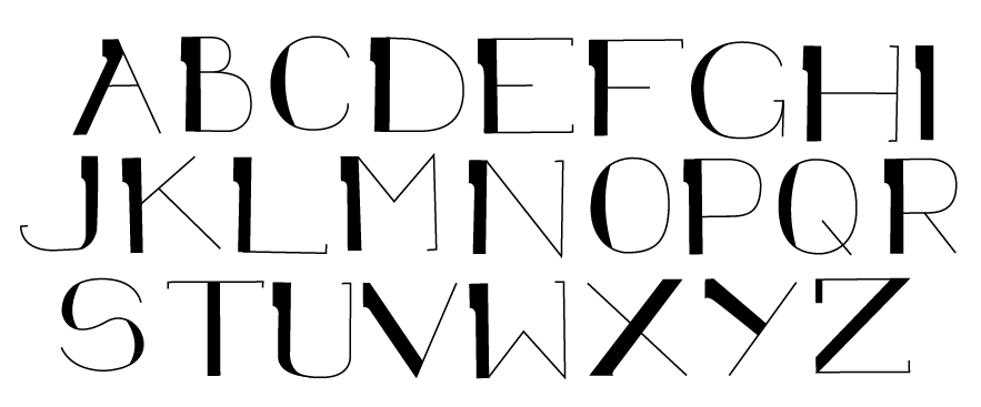
Once I was happy with the final designs I then rendered the font in illustrator, using the path tool to create a vectorised result for the designs and below I have included the finished alphabet that I have created. As you can see the font is very simplistic, providing a very readable result for the viewer, unlike the previous trial.

I then decided that I would create a test piece where I experimented with creating a variety words to make sure that I was happy with how the letters appeared alongside others.
Below I have included the final result and I am overall really happy with it, the font could well do with a few tweaks, such as the width of certain letters and the formation of some, but  I think that it is a really effective and simplistic font. 


Thursday, 19 March 2015

Contextual Portfolio ~ Dada and Surrealism


Dadaism had some similarities with futurism in terms of the aesthetic bult not in terms of the philosophy, it can be seen to have created this typographical revolution. Typography itself was thrown into question along with representation and the image, along with the nature of reality. They wondered how and why typography created meaning, in order to do this it removed the graphic work from the meaning it transmitted. It divided the meaning of the word with what it actually looks like as a semiotic Device.

Visual communication stands independently form it's aesthetically induced meaning. Described as eruptive, non linear and independent form contextual content, they use double meaning and pun, in some cases you can see some of the meaning and content being relevant but generally it was just about the symbols themselves.

In terms of functionality, similarly to the futurists, the layout was random and challenging the existing Norms wasn't concerning dada layouts. Lots of text composed on the same page, placed in disharmonious assembling was as well as disharmonious use of white space. It pushed typography to its limits of legibility. Dadaism was violating the canon, it was being so subversive to try and establish the case for language and logic.

The word Dadaism was selected as a meaningless word which they felt was completely relevant to the movement due to its meaning as "hobbyhorse". Along with type, another technique that was used in this movement was the use of photo collage and montage, developing a unique method of reinterpreting and re contextualising photographs. It allowed the Dadaists to create uncompromising representations whilst altering the meaning, but the images remaining readable. Some of the cubist collages used similar techniques to this. Photomontage was being used in general in 1919 and one reason that the dada artist decided to appropriate was to disrupt this new way of advertising and turning it around and doing something different with it. They mirrored the structural break down of society, they were trying to disturb the viewers interpretation. Quite mischievous and also quite humorous, often quite obscure, creating meaningless and defiance. There was no way to truly decide what the meaning was.

Tuesday, 17 March 2015

Contextual Portfolio ~ The Uncanny

The Uncanny is difficult to define and very difficult to categorise, it's a word that is unrelated to anything else, "Canny" comes from a translation of a German word unheimlich which has the clear meaning of 'homely' suggesting that something uncanny is something unhomely. Weird pictures are often surreal but not necessarily uncanny, they are relatively straight forward images.


The exhibition "Dead Dad" by Ron Mueck has an uncanny effect in the change in scale, the image looks normal yet the model is only tiny. The uncanny is disturbing rather than surprising and this is a perfect example of something that is disturbing. The change in scale is something that creeps up on you slowly.

For an uncanny effect we can distinguish something strange about something familiar, and something strange added to something familiar. Uncanny likeness is a likeness that is strange, but not complete, complete likeness would be identity rather than likeness. Identical twins are an interesting case of the uncanny, we are used to thinking that people are unique, so it is unsettling to see twins. The 'double' is an element in the uncanny according to Freud, the closer the resemblance, the more we see the difference. An example of this would be the twins in the shining, or Diane Arbus identical twins.


Masahiro Mori, the uncanny valley (1970) this idea is concerned with the question of likeness or resemblance, the realism drops away when you get to certain characters. Cuba girl for example is a robot, if you look up this diagram you will find more examples, one of which deals with 2D images and one with 3D, also one with animated and static. Cuba girl is a good example because when she is still, she looks quite realistic and it is only when she starts to move that you get a weird uncanny effect.


A real person doesn't represent the goal of realism but is the model of realism as you wouldn't say "God you look really real". It could be argued that the grey panel is the uncanny. It's when characters get very close together that it becomes uncanny because there is a gap between the two.

Freud believes that the question of likeness isn't very interesting and to not the real meaning of the uncanny, he thinks it's more about repressing a disturbing memory through retreated behaviour. He agrees with Schelling who said the uncanny is everything which should remain mysterious, hidden, latent and has come to light. Both would probably agree that the work of Louise Bourgeois is a good example of the uncanny. The distinction between what is the uncanny and what is not has a very fine line and it is the ways in which the image is interpreted that can distinguish this.

Wednesday, 11 March 2015

Contextual Portfolio ~ Propaganda

It is possible to consider that adverts today use similar techniques and ideas to that of propaganda, the impact the emotions of the viewer by using colours and words selectively to target the audience. Different countries took different approaches in different times.


Above I have included some examples of  various different propaganda posters, they are very direct and have clear and strong instruction, addressing the viewer directly in most cases. They falsely advertise the benefit that the country would have from wars or fighting, misleading the audience and causing them to do what the poster instructs.


Atrocity propaganda as shown in the images above worked by unifying people in fear and rallying people against an enemy by terrifying them, it combines some truth with some false about acts of violence and unarmed prisoners and unarmed people. As well as positive campaigns it focused on the most violent acts. It justified the conflict. They focused very much on some atrocities and not on others so they were very much singled out. The horror allowed people to justify the war.

Propaganda is very much like adverts used in the media today however the adverts used today are more advanced and more clever, using new techniques and subconscious against us ignored to tempt and bribe us to purchase the products being advertised.